Longleaf Partners Funds Shareholder Letters

unconventional180One of the early books that impacted my investing philosophy was Unconventional Success: A Fundamental Approach to Personal Investment by David Swensen. As a very successful manager of the Yale Endowment, he offered common-sense explanations of why low-costs are good and which core asset classes make the most sense to own.

In addition, he pointed out the characteristics to look for in successful active management:

  • Hold a limited number of stocks. Bet boldly on fewer companies (high “active share”), as opposed to being a “closet index fund”.
  • High rate of internal investment. The managers should have a high percentage of their own net worth in the same funds that they ask you to invest in. They should “eat their own cooking.”
  • Limit assets under management. If there is more money flowing in than they can invest efficiently, they should close the fund to avoid asset bloat. This requires them to turn down more money!
  • Reasonable management fees. Active management hash higher internal costs than a passive strategy, but you can still charge less than average.

Swensen pointed out Southeastern Asset Management as an example of a company that most clearly displayed all of these characteristics, but don’t miss the last part of the quote:

Southeastern Asset Management (sponsor of the Longleaf Partners mutual-fund family) exemplifies every fundamentally important, investor-friendly characteristic conducive to active-management success. Portfolio managers exhibit the courage to hold concentrated portfolios, to commit substantial funds side by side with shareholders, to limit assets under management, to show sensitivity to tax consequence, to set fees at reasonable levels, and to shut down funds in the face of diminished investment opportunity.

Even though all the signs point in the right direction, investors still face a host of uncertainties regarding Southeastern’s future active-management success.

Due to this recommendation, I try to keep up with the Longleaf Funds shareholder letters. (You can register for free e-mail updates, even if you don’t own their funds.)

Reading the shareholder letters helps illustrate the many difficulties of active management. Here’s how most of their shareholder letters go, along with specific commentary on individual stocks.

  • Our Partners Fund only holds these 15-25 stocks. Our performance has been [x.xx%]. We have done [better/worse] than our benchmarks.
  • We continue to believe we will generate alpha in the future because we only companies at a significant discount to our conservative appraisals.
  • We claim no ability to predict short-term market moves.
  • We believe that our bottom-up intrinsic value investing approach has positioned the Funds with less risk of permanent capital loss than the relevant indices across all of our strategies.

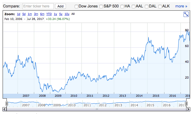
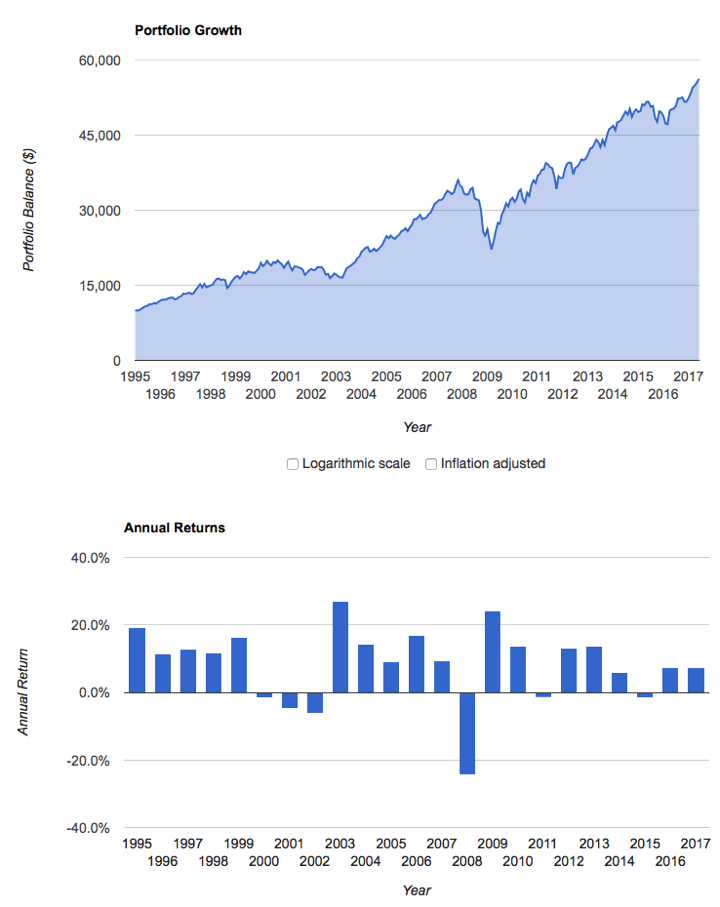
Their flagship Longleaf Partners Fund (LLPFX) has had attractive performance if you look from inception in 1987:

longleaf1987

However, what if you read Swensen’s book when it was popular in 2005 and thought… I should buy some of that! You would have fallen far behind a simple S&P 500 index fund.

longleaf2005

Here’s what Morningstar has to say about it:

Although Longleaf Partners’ 2016 rebound was welcome, past missteps continue to drag down its record and raise concerns about its prospects.

Longleaf again closed their flagship Longleaf Partners Fund (LLPFX) to new investors in June 2017. Their Small Cap fund has been closed to new investors since 1997. This shows that they are still holding true to the positive characteristics listed above. They could make more money by staying open, but they aren’t. Here’s a snippet from their 2017 Q2 Shareholder letter:

The eight-plus year bull market in the U.S. has made finding qualifying opportunities more difficult, particularly in larger cap companies. In addition, this year’s strong returns in most markets outside of the U.S. have made our on-deck list of prospective investments light around the world. Because we have sold and trimmed businesses whose prices have moved closer to our appraisals, our cash reserves are higher than normal. In June, we closed the Longleaf Partners Fund due to limited new investments and a high cash position.

I respect Southeastern Asset Management and I enjoy reading their shareholder letters. They might end up kicking butt in the future. However, I hold no position on any Longleaf funds because I don’t have the level of faith required to maintain my position. It’s a tough world out there, even when you are doing the “right” things. Note that LLPFX charges 0.95% of assets and multiple large-cap index funds only charge 0.05%. Consider that as of this writing, the trailing 15-year total return of LLPFX is 7.12% annualized. The trailing 15-year total return of the S&P 500 is 9.58% annualized. If you held this in a taxable account, the gap would be even wider.

Bottom line. Longleaf Partners Fund continues to be an example of promising characteristics for an investor-friendly, actively-managed mutual fund. However, their recent performance has still been questionable. They may outperform in the future, but will you stick around to see? Reading their free shareholder letters is a good way to learn about what it’s like to invest in a traditional value-oriented, actively-managed strategy.

Free Collection of Investing Books by Meb Faber

investwiththehouse

Free again. Asset manager Meb Faber is promoting the launch of his new book, The Best Investment Writing: Selected writing from leading investors and authors (Vol. 1), by making all four previous self-published books free in Kindle format for a limited time (ends Saturday 8/5). Below are direct links to each book. Check first that the Kindle price is $0 (“0.00 to Buy”), then buy it to own permanently. Do not click “Read for Free”.

Grab them now while they are free, and read later at your convenience. You can read Kindle eBooks on smartphones or on any computer via web browser.

I enjoy reading these books, but I’m always careful when reading about finely-diced backtested strategies that worked well in the past. Before you put your hard-earned money at risk, please realize that even if they continue to work (which is in no way guaranteed given how markets tend to weed out edges), they will still be hard to stick to in real life. At some time, you will underperform other strategies for an extended period of time. You must ride out those low periods in order to achieve any sort of market-beating returns. In my opinion, the fancier the strategy, the harder it is to keep faith.

Most Underfunded Private Pension Plans in the S&P 500 (Infographic)

In addition to data on underfunded state pension funds, Bloomberg also has an infographic on private pensions: S&P 500’s Biggest Pension Plans Face $382 Billion Funding Gap. There are at least 20 large corporations that have put aside less than 70% of what they need to pay out their estimated pension obligations. This is even worse than many state governments, which at least have the ability to increase taxes. Here’s the full list along with their specific funding ratios:

pensionsp500

United Airlines was the largest private pension default in US history. I must admit, I don’t really understand the laws behind private pension obligations. In 2002, United Airlines filed for Chapter 11 bankruptcy. In 2005, a federal bankruptcy judge ruled that United Airlines could default their pension obligations and turn the management of pensions over to the Pension Benefit Guaranty Corporation (PBGC). According to this NYT article, the total shortfall was estimated to be $9.8 billion. Even after the PBGC put up $7.3 billion, this still resulted in a significant cut in promised benefits to many retired workers.

Here’s United’s stock price since emerging from bankruptcy in 2006 (via Google Finance):

ual2017

Yet today, I still see United Airlines on this list at 64% funded. I suppose these are Continental Airlines pensions due to their 2010 merger. American Airlines is also on this list at 58% funded (they also tried to dump their pensions back in 2012). I hope these airlines shores up their pension funds while their stock prices are reaching new highs.

The PBGC has never required taxpayer money and is normally funded by insurance premiums, but it could require a bailout if future pension defaults exhaust PBGC funds. I wonder what kind of future return figures are used in these estimates. If they are too optimistic, the situation could be worse than pictured above.

Fidelity Index Mutual Fund and ETF Expense Ratios (Updated August 2017)

fidodrop0

Updated. Fidelity announced another round of expense ratio cuts effective August 1, 2017. They last announced a big round of expense ratio drops in July 2016. This move allows them to make the following claim:

Fidelity beats Vanguard on expenses on 17 of 17 comparable stock and bond index funds and 11 of 11 comparable sector ETFs. Comparisons based on fund expense ratios only.

fido1708_full

Mutual Fund Share Classes. Fidelity separates mutual funds into Investor Class ($2,500 minimum) and Premium Class ($10,000). Individual ivestors in employer retirement plans may have access to these funds, including institutional share classes, without the minimums. This is in close alignment with Vanguard Investor and Admiral share classes.

Highlights. Here are some broad US and Domestic index funds that I track.

  • Fidelity 500 Index Fund. Investor 0.09% Premium 0.035%
  • Fidelity Total Market Index Fund. Investor 0.09% Premium 0.035%
  • Fidelity (Developed) International Index Fund. Investor 0.16% Premium 0.06%
  • Fidelity Global ex U.S. Index Fund Investor 0.17% Premium 0.10%
  • Fidelity Total International Index Fund Investor 0.17% Premium 0.10%
  • Fidelity Emerging Markets Index Fund Investor 0.29% Premium 0.13%
  • Fidelity U.S. Bond Index Fund Investor 0.14% Premium 0.045%
  • Fidelity Inflation-Protected Bond Index Fund Investor 0.19% Premium 0.09%

Here is the full list with changes (official page):

[Read more…]

Low-Cost Funds Capture Nearly All of the Market’s Gains (and Losses)

Here’s a quick snapshot that illustrates why Vanguard and other low-cost funds are taking assets from active managers. Via this Bloomberg article. The US stock market has been on a great run for nearly 9 years now, and low-cost funds have been giving investors nearly all of those gains.

vgtriple

People always chase past performance. The vast majority of index fund money is in US stock funds, and those have the best recent past performance. But when the US stock market eventually stumbles, those low-cost index funds will also be great at passing along all of those losses.

What will happen then? While it hasn’t been very helpful recently, I still agree with those recommending have diversified exposure into other areas like developed international stocks, emerging markets stocks, and high-quality bonds.

Chart: Hours of Work Required To Buy S&P 500

As the US stock market keeps going up, it feels like everyone is whispering the same thing: We are near a top. It’s easiest to do this with numbers. Here’s a valuation metric that divides the price of the S&P 500 stock index by the median US hourly wage. In other words, how many hours of work does it take to buy a unit of the S&P 500?

hours500

Answer: More hours of work than even at the top of the 2000 tech bubble. Found via WSJ Daily Shot newsletter and @ReutersJamie. Original source appears to be BAML (Bank America/Merrill Lynch).

This concerns me of course, but I’m still a buy-hold-and-rebalance investor at roughly 2/3rd stocks and 1/3rd bonds. Sure, we might be at the top. But we could be at new top next week. There are two only possible states: all-time high or drawdown. Here’s a wise observation by @ClementsMoney:

The good news is, many investors are prepared for a stock market decline. The bad news is, they’ve been prepared since 2011.

How Badly Underfunded is Your State’s Retirement Pension Fund? (Infographic)

The state of Illinois narrowly avoided having their S&P credit rating dropped to “Junk” status, but their current rating is already the lowest ever for any state. Their pension promises now total over $200 billion, but they are a bit short… $120 billion short. That’s only 40 cents saved for every $1 owed. Unfortunately, your state might not be doing that much better. Here is a Bloomberg graphic America’s Pension Bomb which shows the funding ratio for every state available:

pensionmap

This reminds me of a car wreck in slow-motion. Politicians get to make financial promises that can last 30-50 years, but they are only interested in being elected for the next 2-4 years. How will it end? Will states accept the pain now to fix things and get back on track? Or will they just keep kicking the can down the road until faced with huge tax hikes or maybe even a federal bailout?

If you are a municipal bond investor, Vanguard says not to worry: Despite Illinois’s financial troubles, muni market looks strong. Well, it’s good to see that Illinois is only about 1% of their national, investment-grade muni bond funds. I’m not worried about a crisis in the next few years either, but I also don’t see any evidence that things are getting better. I was planning to diversify my muni bond holdings anyway as my income drops in early retirement. Perhaps it’s time to speed up that timetable.

Portfolio Visualizer: Asset Allocation Backtesting and Monte Carlo Simulation Tool

portpie_blank200Here’s another neat (and free!) portfolio analysis tool – PortfolioVisualizer.com. You can upload a custom asset allocation and get all sorts of backtest data and Monte Carlo simulation results from it. If you register for an account, it will remember your model portfolios for future use.

I created a custom portfolio “MMB Default” similar to my current portfolio asset allocation and below are selected charts that were produced. Here’s the summary:

pv1

Historical portfolio growth and annual returns. (Note that the time period shown was limited because the available data for Emerging Markets only went from 1995-2017. Apparently there are some ongoing issues with data licensing.)

pv2

Historical drawdowns during the same period. This provides a good feel of how “painful” it was to hold this portfolio. 2009 was certainly a stressful year when both our portfolio and future job prospects were being questioned.

pv3

Monte Carlo simulation of 4% withdrawal rate over a 30-year retirement period. I used my custom portfolio and had it simulate a withdrawal rate of $40,000 from a $1,000,000 portfolio (4%), adjusted annually for inflation, for a 30-year period. You can alter nearly all of these variables (withdrawal rate, inflation adjustments, period length, etc). Monte Carlo basically looks at many possible trajectories based on historical asset return characteristics. If things turn out well, you end up with a “runaway” portfolio, but if they don’t you can hit zero pretty fast.

pv4

The success rate looks at the percentage of simulated scenarios that end up with a positive value at the end of the period. At a 4% withdrawal rate for 30 years, it was 95%. At a 5% withdrawal rate for 30 years, it was only 84%. At a 5% withdrawal rate for 50 years, it was only 69%.

Here’s where I warn you that Monte Carlo simulations are not the end-all of portfolio safety. You can’t predict the next 50 years when you can barely look back 50 years. Living off a portfolio for decades involves not just a reasonable rate of withdrawal but planning as to how you could cut expenses or create additional income if conditions go sour for an extended time period. I’d rather have 90% theoretical safety and a flexible backup plan over 99% theoretical safety and no backup plan.

Portfolio Visualizer has several additional features that I may never use, but even the above is enough to make it a very interesting tool for the DIY investor. I hope they get their data source issues sorted out eventually. You can find all of my posts about portfolio tools in the Tools & Calculators category.

Jack Bogle Full Interviews with CNN and Business Insider

boglecnn2
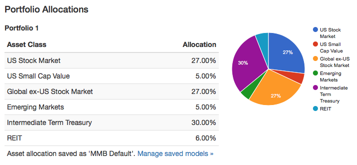
If you haven’t gotten a dose of Jack Bogle wisdom recently, check out this full Business Insider interview transcript and this 16-minute CNN video interview. There is a lot of ground covered between them. Here are my selected notes:

S&P 500 dividend income reliability. Bogle seems to support the idea of relying on S&P 500 stock dividends to supplement Social Security:

The basic idea of retirement income is, to me, to get a check, two checks every month, one from your fixed income and one from equity account. And you want them to grow over time. Social Security is a cost-of-living hedge, and in the equity account dividends grow over time.

The record of the S&P 500 dividends is almost a complete up trend with only two big declines going back into the ’20s. One would be in 1930s — ’33 or ’34 — and the other is when the banks stocks eliminated their dividends, back in 2009. Those are really the only significant declines in the dividends.

Investors make a big mistake by thinking too much of the value of the account and not enough about the monthly income they want to get. We could have a significant decline in the market with dividends unchanged.

Here’s a chart of the S&P 500 dividend history via Multpl.com:

sp500divmult

Helping investors improve their behavior. For example, 401(k) plans were not designed to be your primary retirement vehicle, and thus have a lot of flexibility built into them. However, this flexibility means a lot of people take money out of their 401(k) when they switch jobs or for loans that never get paid back. A similar thing when people chase performance:

With actively managed funds, people have big behavior problems. With funds that have done well, they put their money in, and when it has done bad, they want to take it out. The index fund always gives you the market return. It may be bad sometimes — it will be bad sometimes — but there’s just no evidence that active managers can win [long term].

Why you don’t see performance-based incentive fees for fund managers. I didn’t know about the SEC symmetrical rule:

The active managers have their work cut out for them. One thing they could do is put in an incentive fee. Get 10 basis points or five [0.10% or 0.05%], unless they beat the market. We’re paying people to beat the market when they aren’t doing it, and when you think about it, that doesn’t make sense.

They can put their expense ratio at 5 [basis points, 0.05%] and get another 1% if they beat the market by X. But they have to, under the SEC rules, be symmetrical. So if they lost to the market by 1%, they would be out of pocket. Managers, at least in this context, are not stupid. They know perfectly well they are going to lose that bet.

What happens if index funds continue to grow in popularity:

Right now I believe indexing to be about 22% to 25% of the marketplace. It’s not disturbing anything. Could it go to 50% and not disturb anything? I believe it could. All you’re doing is immobilizing X percentage of the shares in the market. The remaining 50% can trade away to their hearts’ content.

Could it handle 90%? I think it could, but we’re so far away from that, I don’t spend a lot of time thinking about it. The reality here, however, is that even if the market would reach a level of inefficiency, which everyone says then the active managers can win because then they can find underpriced stocks. [Laughs] It’s such a ridiculous argument it hardly bears refuting. The fact is, if the market is more inefficient, it would be easier for half of the managers to win and by definition easier for half of the managers to lose. Because every purchase is a sale and every sale is a purchase.

This is not a problem that I worry about very much. Markets stay relatively efficient because there continues to be big rewards for those that can figure out any small inefficiency, even for a short period of time. Those rewards aren’t going aways, so markets will stay efficient, and low costs will continue to matter.

Research Affiliates Custom Portfolio Expected Returns Tool

crystal_ball_hp

Investment advisory firm Research Affiliates has updated their interactive Asset Allocation tool, which now provides estimates of expected returns for more than 130 asset classes and model portfolios. There are two expected return models, “valuation-dependent” and “yield-plus-growth”. In addition, you can input your own custom asset allocation.

My initial reaction is that while the tool got new bells and whistles, it also became more confusing to navigate and harder on the eyes. Here’s a screenshot of their scatter plot showing the expected risk and return for several asset classes under their valuation-dependent model.

raf_aa1

I created a custom portfolio “CustomMMB” using my current portfolio asset allocation and it is charted below on their risk/return map. In a separate window (not shown) you can see how each individual asset class contributes to the total expected return.

raf_aa2

As you can see, my portfolio did not offer the maximum expected return for its risk level. The RA efficient model portfolio that did includes an exotic mix of asset classes, including Emerging Markets bonds (non-local currency), Bank Loans, US Private Equity, European Private Equity, and direct investments into US Commercial Real Estate (not through REITs). Unfortunately, I’m not even sure how to access many of those asset classes.

I appreciate that they freely share their research methodology and results, specifically covering the valuation perspective. US Equities have historically high valuations, but interest rates are also at historically lows. The next 10 years should be interesting…

Another portfolio analysis tool that lets you input your specific asset allocation is PortfolioCharts.com Safe Withdrawal Rate calculator. This Research Affiliates tool says my expected 10-year real return is only 2.4% (equates to a nominal expected return of 4.6%). The PortfolioCharts.com tool says the same personal asset allocation has a historical perpetual withdrawal rate of over 4% over a 40-year timeframe.

PortfolioCharts.com Safe Withdrawal Rate Tool (Updated)

eggosI just noticed that PortfolioCharts.com has updated their Withdrawal Rate Calculator. It has improved visualizations and as a personal finance geek I even found it fun. You can enter your specific asset allocation slices down to 1% and see customized results.

The Withdrawal Rates calculator shows the safe withdrawal rate for any asset allocation over a variety of retirement durations based on real-life sequence of returns. Those looking to retire early or leave money to heirs can also see the perpetual withdrawal rate that protected the original inflation-adjusted principal.

You can read about the specifics behind these improvements here. You should also read all the assumptions here. For example:

The withdrawal rate is the percentage of the original portfolio value used for one year of retirement expenses. Each year, expenses are adjusted for inflation (not for portfolio size) to maintain constant purchasing power.

Briefly, a “safe” withdrawal rate (orange) allowed a portfolio to go as low as $1 but never hit zero at the end of the timeframe. In other words, the ride could have still gotten quite hairy for a while. A “perpetual” withdrawal rate (green) never ended up less than the initial principal, even adjusted for inflation. The author Tyler recommends the perpetual WR for early retirees or for people who desire to leave an inheritance for heirs.

Here is the specific chart for my current portfolio asset allocation:

pcharts_me

I would be quite happy with being able to confidently withdraw over 4% (+ inflation adjustments) of my portfolio for the next 40 years. The short-term drawdown paths can still be scary though. The usual caveats with using backtested data also apply.

Playing around, I noticed that the simplest way to change things up was by adding a healthy chunk (~20%) of gold instead of stocks. This seemed to significantly improve the perpetual withdrawal rates in the short-term (0 to 15 years). It’s too bad I still don’t have a firm fundamental understanding of gold. If you can’t maintain faith in it when things are scary, then you shouldn’t own it in your portfolio.

New Low-Cost Broad Commodity ETFs from GraniteShares

bcom

Commodities are an asset class that some investors include in their portfolio for diversification purposes. Depending on the specific index, you might track the futures market for aluminum, coffee, copper, corn, cotton, crude oil, gold, diesel, lean hogs, live cattle, natural gas, nickel, silver, soybean meal, soybean oil, soybeans, sugar, unleaded gas, wheat, and zinc (image source).

In my experience, when commodities prices have been hot, you see them in a lot of portfolios. When commodities prices have been cold (as they have been recently), you don’t read about them as much. Via ETF.com, there are now a new wave of commodity ETFs that hope to gather assets as the next up-cycle begins.

Here are some of the reasons why people didn’t like commodity ETFs in the past (besides the volatility and poor past performance):

  • Higher costs. Expense ratios for most commodity ETFs were above 0.50% annually, with many closer to 1%
  • Late K-1 tax forms. Most commodities ETFs issued Schedule K-1 forms at tax time, which not only were an extra form to file but they also tended to come very late in the year. You might have all your 1099s by the end of January, but your K-1 might not trickle in until March or even April.
  • Some were actually exchange-traded notes (ETNs), which carried credit risk as they were technically unsecured debt obligations of the issuer. In contrast, ETFs hold securities separately in trust with a custodian. If an ETF issuer fails, you still own the underlying assets.

Here are two new ETFs that address the issues above with (1) have lower costs and (2) a new structure that doesn’t issue K-1 forms:

  • GraniteShares Bloomberg Commodity Broad Strategy No K-1 ETF (COMB) – This ETF is technically actively-managed, but is benchmarked against the Bloomberg Commodity Index (BCOM). It is structured as a 1940 Act funds and thus does not issue K-1s. The expense ratio is 0.25%. Fact sheet.
  • GraniteShares S&P GSCI Commodity Broad Strategy No K-1 ETF (COMG) – This ETF is technically actively-managed, but is benchmarked against the S&P GSCI commodity Index. It is structured as a 1940 Act fund and thus does not issue K-1s. The expense ratio is 0.35%. Fact sheet.

The 0.25% expense ratio of COMB makes it the cheapest broad commodity ETF available today. (The ETFS Bloomberg All Commodity Strategy K-1 Free ETF (BCI) has an expense ratio of 0.29%.) Now, the following bit from this ETFTrends article brings up the worry that this “no K-1 structure” might produce tracking error against the index.

In an attempt to help investors avoid K-1s, the ETFs do not invest directly in commodity futures but rather gains exposure to these investments by investing a portion of its assets in the GraniteShares BCOM Cayman Limited, a wholly-owned subsidiary of the Fund organized under the laws of the Cayman Islands. The subsidiary is not an investment company registered under the Investment Company Act of 1940 and has the same investment objective and will follow the same general investment policies and restrictions as the funds.

If you don’t buy the futures directly, what are you buying? Are you saying that you are buying a subsidiary that does buy the futures directly? How does that indirect structure change your investment performance? I don’t know and I don’t plan on buying either ETF, but I thought I’d point it out. ETF.com doesn’t seem to be worried:

Technically, both COMB and COMG are actively managed, but in practice, they are mostly passive funds. The futures portion of the portfolio, up to 25%, is held in a subsidiary based in the Cayman Islands and generally reflects the index, while the collateral is held in a cash portfolio holding fixed-income securities that is managed stateside.

The GraniteShares ETFs above only launched 5/22/17 and the last time I checked ETFdb.com only had about $2.5 million in assets so it is too early to make any judgments. The CEO of GraniteShares is William Rhind, who formerly worked at Blackrock/iShares and as the CEO of the popular SPDR Gold Shares ETF (GLD).

If you like low-cost access to the commodities asset class, this looks to be a positive development. I personally choose not to invest in this asset class as I think the long-term returns will be lower than that of equities. (Lower costs should improve the return outlook, however.) Commodities funds may offer the draw of being a diversification “hedge”, but I don’t want to pay the price of lower returns, high volatility, and higher complexity. There are many smart minds that disagree, so do your own research as well.