One of the early books that heavily impacted my investing philosophy was Unconventional Success: A Fundamental Approach to Personal Investment by David Swensen. As a very successful (active!) manager of the Yale Endowment, he offered common-sense explanations of why low costs are good and which core asset classes make the most sense to own.
In addition, he pointed out the characteristics to look for in successful active management:
- Hold a limited number of stocks. Bet boldly on fewer companies (high “active share”), as opposed to being a “closet index fund”.
- High rate of internal investment. The managers should have a high percentage of their own net worth in the same funds that they ask you to invest in. They should “eat their own cooking.”
- Limit assets under management. If there is more money flowing in than they can invest efficiently, they should close the fund to avoid asset bloat. This is hard to do, as it requires them to turn down more money! 😮
- Reasonable management fees. Costs still matter, and the lower the expense ratio, the lower the hurdle to overcome and the more “alpha” ends up in your pocket.
Back in 2005, Swensen specifically named Southeastern Asset Management and their flagship Longleaf Partners Fund (LLPFX) as an example of a company that most clearly displayed all of these characteristics, but also added an important caveat at the end:
Southeastern Asset Management (sponsor of the Longleaf Partners mutual-fund family) exemplifies every fundamentally important, investor-friendly characteristic conducive to active-management success. Portfolio managers exhibit the courage to hold concentrated portfolios, to commit substantial funds side by side with shareholders, to limit assets under management, to show sensitivity to tax consequence, to set fees at reasonable levels, and to shut down funds in the face of diminished investment opportunity.
Even though all the signs point in the right direction, investors still face a host of uncertainties regarding Southeastern’s future active-management success.
So for the last 18 years (!), I have kept up with their quarterly and annual shareholder letters. (You can register for free e-mail updates, even if you don’t own their funds.)
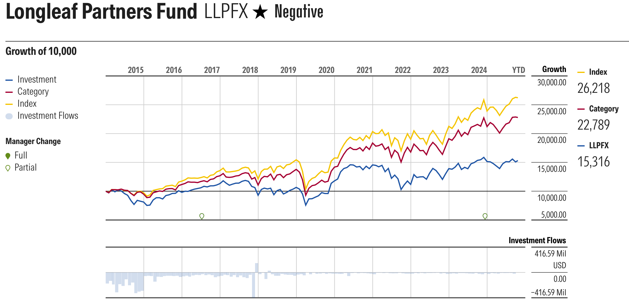
Unfortunately, the performance of the Longleaf Partners Fund for most of that time has been rather dismal. LLPFX is the blue line, while the (no cost) index benchmark (Morningstar US Mid Broad Value TR USD) is yellow, and the category of peers (Mid-Cap Value) is red.
Here are the latest return numbers after Q3 2025:
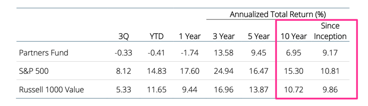
This fund started out in 1987 and had some great outperformance all the way up through the early 2000s, which is how they became well-known. However, you’ll notice that even including its early success, over the long run it has lagged it’s Large Value index benchmark by very close to its expense ratio. (Costs matter.) If you exclude that part and invested after its early outperformance (or after you read this famous book), then you did much worse.
I am not trying to pick on this fund to be mean. I track them because they showed all the good things to look for in an active manager. They even closed the fund to new money in 2017, which means they gave up easy money when they didn’t have enough things to buy. That’s really rare! I would be happy to see them succeed.
I have access to Morningstar reports via my library, and even today, M* acknowledges that the managers of Longleaf Partners own over $1 million of the fund themselves (“eat their own cooking”), have below-average costs (for an active fund), and have a long average manager tenure (48 years). But yet their “Parent” rating is low because of their poor past performance? In the end, despite all the supposedly different factors they examine, it seems that Morningstar ratings are still primarily about past performance. LLPFX currently has 1 sad star.
For all that I can see, the managers of Longleaf Partners continue to try and do things the “right” way. They are experienced value-investing managers that showed skill and invested only in high-conviction picks. They had early success and the freedom to invest however they chose. They have shown patience and the willingness to avoid asset bloat. But even with all that they did not beat the S&P 500 or even the majority of their fund peers over the last decade.
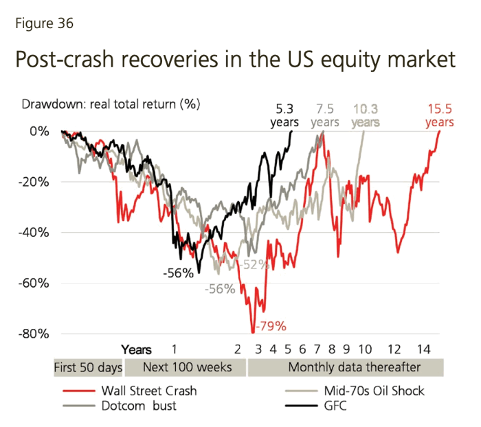
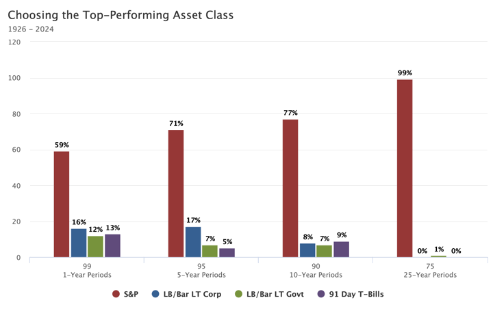
Bottom line. Finding what has performed well recently by looking backward is easy. Actually beating a low-cost index fund for a 10 to 20+ year period in the future by picking stocks or picking a manager today is very hard, in my opinion much harder than most people like to think. I always try to remember this when I think about investing in something new that I just read about…


 The Best Credit Card Bonus Offers – 2026
 Big List of Free Stocks from Brokerage Apps
 Best Interest Rates on Cash - 2026
 Free Credit Scores x 3 + Free Credit Monitoring
 Best No Fee 0% APR Balance Transfer Offers
 Little-Known Cellular Data Plans That Can Save Big Money
 How To Haggle Your Cable or Direct TV Bill
 Big List of Free Consumer Data Reports (Credit, Rent, Work)