Morningstar Target Date Retirement Fund Comparisons & Trends 2013

Target date funds (TDFs) get their name because they adjust their portfolio holdings automatically over time based on a given target retirement date. In general, this means shifting from mostly stocks to less stocks over time (known as the “glide path”). TDFs continue to grow in popularity, especially within employer-based plans like 401k’s and 403b’s.

Morningstar Fund Research recently released its 2013 industry survey, Target-Date Series Research Paper [pdf]. While it feels targeted at financial professionals, there are some good nuggets for us individual investors looking to decide where to invest. For example, we have to be careful as look how widely the glide path can very between different brands of target funds:


(click to enlarge)

While the most popular TDF providers have much more similar glide paths, they still differ in important ways (especially after retirement age).


(click to enlarge)

Other highlights from the paper:

[Read more…]

OptionsHouse Raising Commission Rate From $3.95

Online stock broker OptionsHouse sent me the following e-mail today:

On October 1, 2013, OptionsHouse is changing our stock commissions rate. However, we wanted to notify you that this change will not affect any of your current accounts with us. In addition, if you choose to open and fund any additional accounts in the future, you will continue to receive your current stock commission rate. For full details related to changes to our stock commissions, please visit our rules page.

Basically, their commission on stock trades is going up from $3.95 to $4.75 for new customers only. Existing customers will stay at $3.95. They’ve done this before, as I’m actually grandfathered in at $2.95 a trade (opened back in 2010), which I think is a good way to treat existing customers. Options pricing remains the same, starting at $5 for up to 5 contracts. Under $5 a trade with no minimum balance requirements is still very competitive.

There is still a small window if you want to get yourself grandfathered in at $3.95 a trade. You must complete your application prior to 10/1/2013 and fund your account prior to 1/1/2014. There are a variety of promotions available for new customers. You can only get one of these, so pick carefully:

Vanguard REIT Fund Historical Total Annual Distributions 2000-2012

The Vanguard REIT Index Fund provides low-cost, broad exposure to real estate investment trusts (REITs). It is available in mutual fund (VGSIX, VGSLX) and ETF shares (VNQ). A unique feature of this asset class is that to qualify as a REIT, a company must distribute at least 90 percent of its taxable income to its shareholders annually. This means that the income earned by this collection of commercial property (shopping malls, office buildings), self-storage companies, apartment complexes, and nursing homes is almost 100% spit out as dividends. (Note that REIT distributions don’t qualify for the preferred dividend tax rates).

I was curious as to what it would have been like to hold this fund and treat it like an income-producing rental property. Let’s say I bought it starting January 2000 and held it until today. I went on Yahoo Finance and looked up the historical distributions for VGSIX and added them up on an annual basis. Here’s what you would have earned per share:

As the share price in 2000 was about $10, you would have started with roughly an 8% annual yield. Based on that initial $10 number, your annual yield would have risen to nearly 12% in 2005 and dropped to 6% in 2010. Of course, the share price did vary over the entire period, with some big swings and ending up at over $20 today. On a total return basis (share appreciation plus dividends), this fund has shown significant volatility but has done quite well for those that held on:

[Read more…]

$30,000 Beat-the-Benchmark Experiment Update – September 2013

Here’s the September 2013 update for my Beat the Market Experiment, a series of three portfolios started on November 1st, 2012:

  1. $10,000 Passive Benchmark Portfolio that would serve as both a performance benchmark and an real-world, low-cost portfolio that would be easy to replicate and maintain for DIY investors.
  2. $10,000 Beat-the-Benchmark Speculative Portfolio that would simply represent the attempts of an “average guy” who is not a financial professional and gets his news from mainstream sources to get the best overall returns possible.
  3. $10,000 P2P Consumer Lending Speculative Portfolio – Split evenly between LendingClub and Prosper, this portfolio is designed to test out the alternative investment class of person-to-person loans. The goal is again to beat the benchmark by setting a target return of 8-10% net of defaults.

As requested, I updated the scale to zoom in on the comparison chart.

Summary. 10 months into this experiment, the Benchmark and Speculative portfolios have suddenly pulled neck-and-neck, with less than $25 separating them ($11,060 vs $11,083). Both US and Emerging Markets stock indexes have dropped recently, while my Apple shares have risen in anticipation of new product launches before the holiday season. Both P2P portfolios are still paying out competitive interest although late loans continue to pop up. Values given are as of September 1, 2013.

$10,000 Benchmark Portfolio. I put $10,000 into index funds at TD Ameritrade due to their 100 commission-free ETF program that includes free trades on the most popular low-cost, index ETFs from Vanguard and iShares. With no minimum balance requirement, no maintenance fees, and no annual fees, I haven’t paid a single fee yet on this account. The portfolio was based loosely on a David Swensen model portfolio. Portfolio value is $11,060. Screenshot of holdings below:

[Read more…]

Mosaic: Crowdfund Solar Projects With Just $25, Earn 5% Interest

Mosaic is a new crowdfunding start-up allows investors to invest in clean energy projects with as little as $25. A solar power farm needs financing to get built. They sell the energy produced to customers like major utilities and then pay investors back. Mosaic takes a cut. Mosaic has recently been more projects since their debut (and sellout) earlier this year.

Below is a screenshot of an actual project with a 12-year horizon with expected 5.5% yield that is currently in funding – the one I was looking at yesterday already funded! If you live in California, you’re likely to be familiar with PG&E which made a 20-year agreement to purchase power from this project. On the production end, Panasonic is guaranteeing a minimum power production level for 12 years (or else they cover the difference). I’m not sure what the interest rates on these types of project would be on the open market, but right now Yahoo Finance shows the average yield on a AAA-rated 10-year corporate bond to be 3.60%.

[Read more…]

Chart: Investment Returns Vary, Even Over The Long Run

Updated and revised 2013. You often hear that stock investing is a sure thing over the “long run”. But as this chart from the NY Times and Crestmont Research shows, there is still a lot of variability involved. The matrix below visually displays the annualized returns for the S&P 500 for every starting and ending year from 1920 to 2010, adjusted for inflation, taxes, and transaction costs.


(click to enlarge)

Your actual returns depend a lot upon when you start, and also when you finally withdraw:

After accounting for dividends, inflation, taxes and fees, $10,000 invested at the end of 1961 would have shrunk to $6,600 by 1981. From the end of 1979 to 1999, $10,000 would have grown to $48,000.

“Market returns are more volatile than most people realize,” Mr. Easterling said, “even over periods as long as 20 years.”

Some further observations:
[Read more…]

Betterment Bond Portfolio Asset Allocation Changes 2013

Online investment manager Betterment.com recently announced an upcoming change to their portfolio asset allocation, specifically their bond portion. Here’s a visual example of the ETF changes:


(click to enlarge)

I have mixed feelings about this change…

This is a fundamental shift in philosophy and it smells like performance chasing. The original allocation of 100% Treasury bonds (50% Nominal, 50% Inflation-Linked) likely came from David Swensen, as he is the Yale Endowment manager that supported the idea that you should own only the highest-quality bonds and take your risk on the stock side where your interests are aligned with the corporations. (With bonds, corporations and governments are trying to look as safe as possible even if they aren’t. This way, they pay lower interest rates.)

Now, suddenly they want to shift to a “broad global exposure” type of portfolio with lower credit quality and higher risk. Why now? Why was 100% US fine for 3 years but no longer? Perhaps because Treasuries and TIPS in general haven’t been doing that great recently? Perhaps because Emerging Markets bonds have had very high returns during that same period?

Still, it is following general industry movements. Vanguard has also added international bonds to their lineup of Target Retirement Funds. Many more international bond funds are available from many other providers. It appears that the costs for investing in international developed and emerging market bonds have dropped low enough that they can be indexed efficiently. I’m personally not convinced it is necessary and don’t own any international bonds myself, but I can understand the diversification argument.

[Read more…]

LendingClub and Prosper vs. High Yield Junk Bonds

Yesterday, I posted a 9-month update on my $10,000 P2P lending portfolio with loans from Prosper and LendingClub. Every so often it is pointed out that lending unsecured money directly to random people at high interest is not very safe, and you could just invest in junk bonds from shakier companies instead.

“Junk” bonds, also known as High Yield bonds, are bonds from companies which have earned a credit rating from one of the major rating agencies that is worse than the “investment-grade” tier. Perhaps the company already has a lot of debt, or its balance sheet is otherwise worrisome. Bonds from some pretty big and well-known companies have been rated junk from time to time.

This is not a detailed analysis and not even technically an apples-to-apples comparison, but I ran some quick numbers to satisfy my own curiosity. The iShares iBoxx $ High Yield Corporate Bond ETF (HYG) is the largest high yield US corporate bond ETF, with over $15 billion in assets and an expense ratio of 0.50%. Here’s a chart of the credit rating breakdown of the portfolio, taken from their latest Q2 2013 factsheet.

[Read more…]

LendingClub vs. Prosper Loan Performance Comparison, 9-Month Update

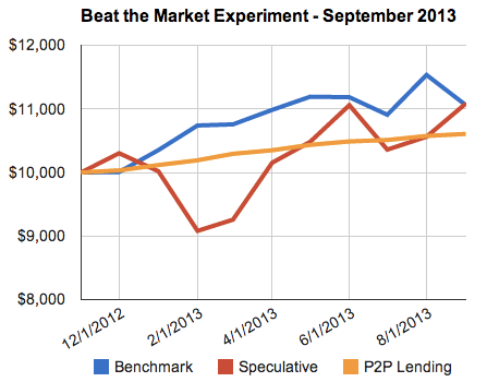
I invested $10,000 into person-to-person loans in November 2012, split evenly between LendingClub and Prosper. It’s been a little over 9 months since then, so I wanted to give a detailed update in addition to my brief monthly updates. The primary goal of this portfolio is to earn a target return of 8-10% net of defaults, but I also wanted to see if there were significant differences between the two competitors Prosper and LendingClub.

I’m also considering liquidating both portfolios after 12 months have passed. I’m getting a little bored with the experiment, and having to sell the loans would also allow me to compare the ease of selling either company’s loans on the secondary market.

Portfolio Credit Quality Comparison

I wanted to keep these portfolios comparable in terms of risk level, while still trying to maximize overall return net of defaults. Peter Renton of LendAcademy made this helpful chart comparing estimated defaults rates with their respective credit grades. Since each company has their own proprietary credit grading formula, they don’t match up perfectly.

Here’s my portfolio breakdown:

[Read more…]

New 401k Plan Fee Disclosures Completely Worthless?

I’ve written about how recent fee disclosure requirements for 401(k) retirement plans have brought a spotlight on bad 401k plans and their potentially embarrassed plan sponsors.

But after reading the fee disclosure on my wife’s own 401(k) plan, I must say that I’m now thinking that maybe nothing really happened at all. Check out what mine says under “Potential General Administrative Fees and Expenses”:

Administrative Fee – Per Account When applicable, other general administrative fees for plan services (e.g., legal, accounting, auditing, recordkeeping) may from time to time be deducted as a fixed dollar amount from your account. The actual amount deducted from your account, as well as a description of the services to which the fees relate will be reported on your quarterly benefit statements.

Translation: We might charge you some fees. We might not. Helpful, eh?

There’s more:

[Read more…]

GMO July 2013 7-Year Asset Class Forecast

It may qualify as market noise, but I admit to looking at the GMO 7-Year Asset Class Forecasts whenever they come out once a quarter (or more often now?). You can read it and other market commentary from Jeremy Grantham (whose opinions I respect) for free by registering on their website. The most recent one was released a few days ago:


Source: GMO.com (click to enlarge)

Most of the time, I just like looking at these forecasts because they reinforce the idea that I should rebalance and buy whatever has been underperforming lately. Right now, that’s Emerging Market stocks. I also see some logic in buying some Timber REITs as part of my REIT exposure, as I don’t believe Timber REITs are included in the Vanguard REIT ETF (VNQ). Invest in tree farms!

I don’t like the “High Quality US Stocks” category because it doesn’t explicitly state what those are. How else will we know if the prediction was right?

Vanguard Balanced Fund: The Benefit of Balancing Stocks and Bonds

An important tenet of portfolio construction is diversifying between stocks and bonds. While poking around on Morningstar, I stumbled across a quick real-world example of how this works.

Let’s say you had $10,000 back on January 1st, 1993. Now, let’s see how that money would have grown over time until today (August 9, 2013) depending on what you invested it in. That’s means holding over a 20-year period – that’s 20 years of bubbles, crashes, euphoria, fear, and a constant flow of bold predictions and catchy newspaper headlines.

1. Vanguard Total Stock Market Index Fund, Investor Shares (VTSMX).

Let’s say you invested in this huge, popular index fund that passively tracks the entire US stock market. (See What’s Inside the Vanguard Total Stock Market Index Fund?) From afar, you may be happy with this chart. But having lived through it, I can say that it was quite a wild ride. People tend to remember the highest value of their portfolio. Your money would have grown to $37,000, only to fall all the way back to $23,000 in the Tech Bubble Crash (a 38% drop). Later, your $46,000 would have dropped 50% all the way to $23,000 during the Housing Bubble Crash. So between 2003 and 2009, your money would have gone nowhere even as inflation rose. Many people went to cash. But if you stuck it out, today you’d be sitting on a balance of $58,621.

2. Vanguard Total Bond Market Index Fund, Investor Shares (VBMFX)
Now, what if you invested in this fund that tracks the overall US bond market?

[Read more…]